Drift Interiors: Before & After
When Drift Interiors first approached us, they weren’t considering a rebrand; they wanted a new website.
On the surface, that made sense. Their business had evolved, their audience was growing, and their existing site no longer reflected the level of product they were offering. But during our discovery call, it quickly became clear that a new website alone wouldn’t solve the real issue.
The problem wasn’t the site, it was the brand sitting underneath it. The current website lacked personality and individuality because it relied solely on their logo.
Logo: Before
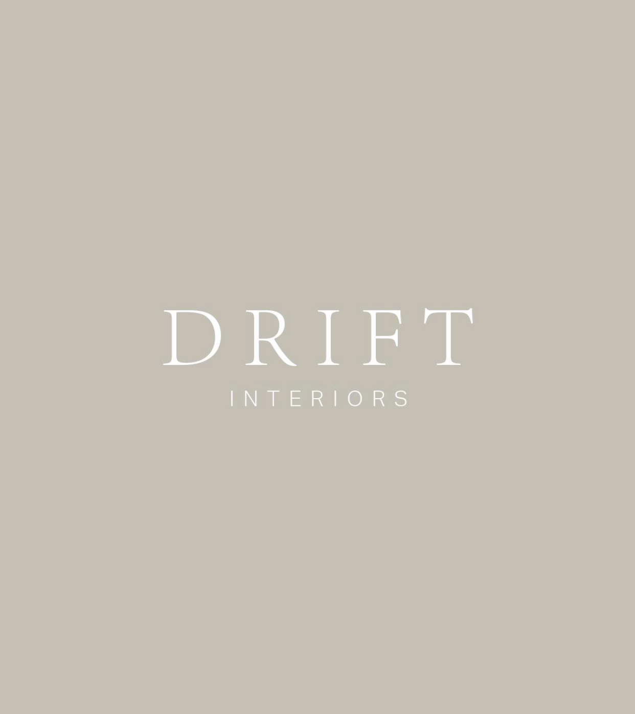
Logo: After
Before: a name, not a brand
Drift’s original logo was a simple text mark that they had created in Canva. It was perfectly fine at a glance, and importantly, they were happy with it, but a text logo is not the same thing as a brand. It’s your name written in a font. It isn’t distinctive, it isn’t ownable, and it isn’t memorable. It can’t be copyrighted or trademarked, and it doesn’t create the recognition a wider brand would build.
Drift were creating beautiful, handcrafted products with real quality and intention, but their visual identity wasn’t communicating that. There was a gap between how good the product was and how the business looked from the outside.
A new website wouldn’t have fixed the foundation.
The decision to rebrand
This is the point where we had an honest conversation. We explained that we couldn’t take the project as a website-only redesign, as the website wasn’t the problem, the problem was that they were missing a brand identity.
Drift had real potential. With the right positioning, they could appeal to a more design-led, higher-end customer base and build a brand that felt considered, confident, and memorable. But to do that properly, everything needed to be aligned.
After: building a brand with weight
The rebrand went far beyond a logo refresh. We developed a full visual identity that gave Drift a clear presence and point of difference.
What they had before:
A text based logo made on Canva
1 brand colour
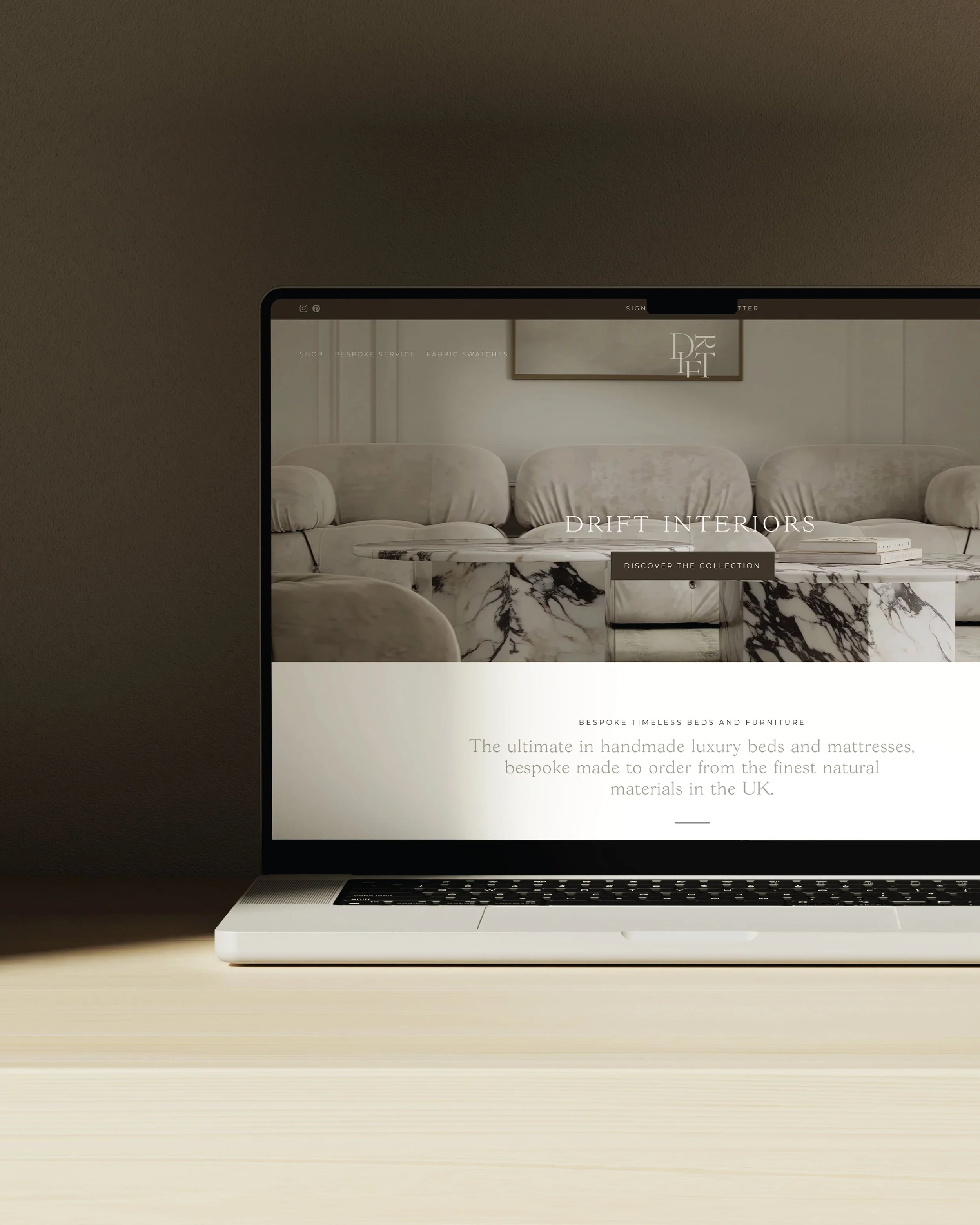
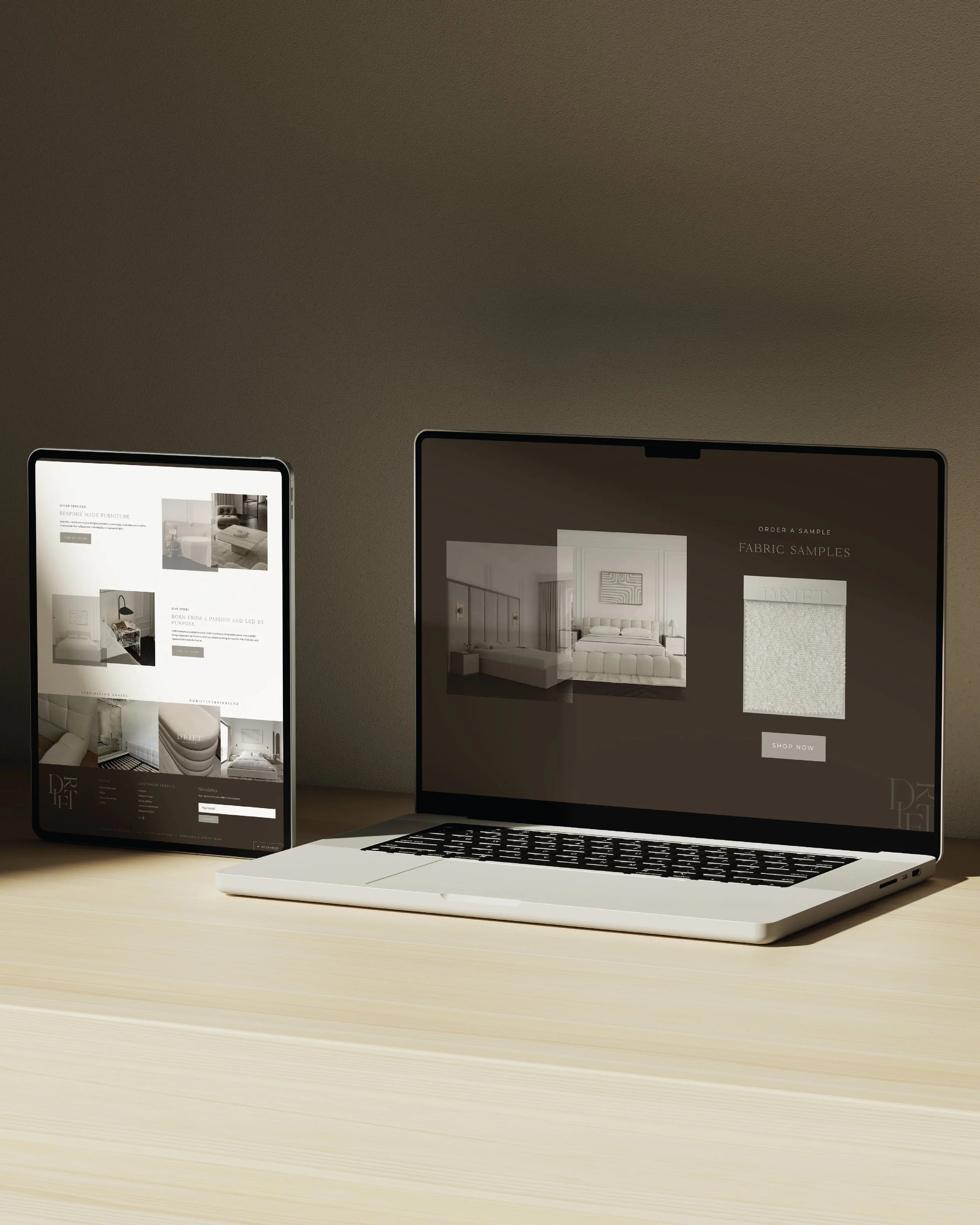
A Shopify website that lacked distinction and personality
What they had after:
A brand strategy
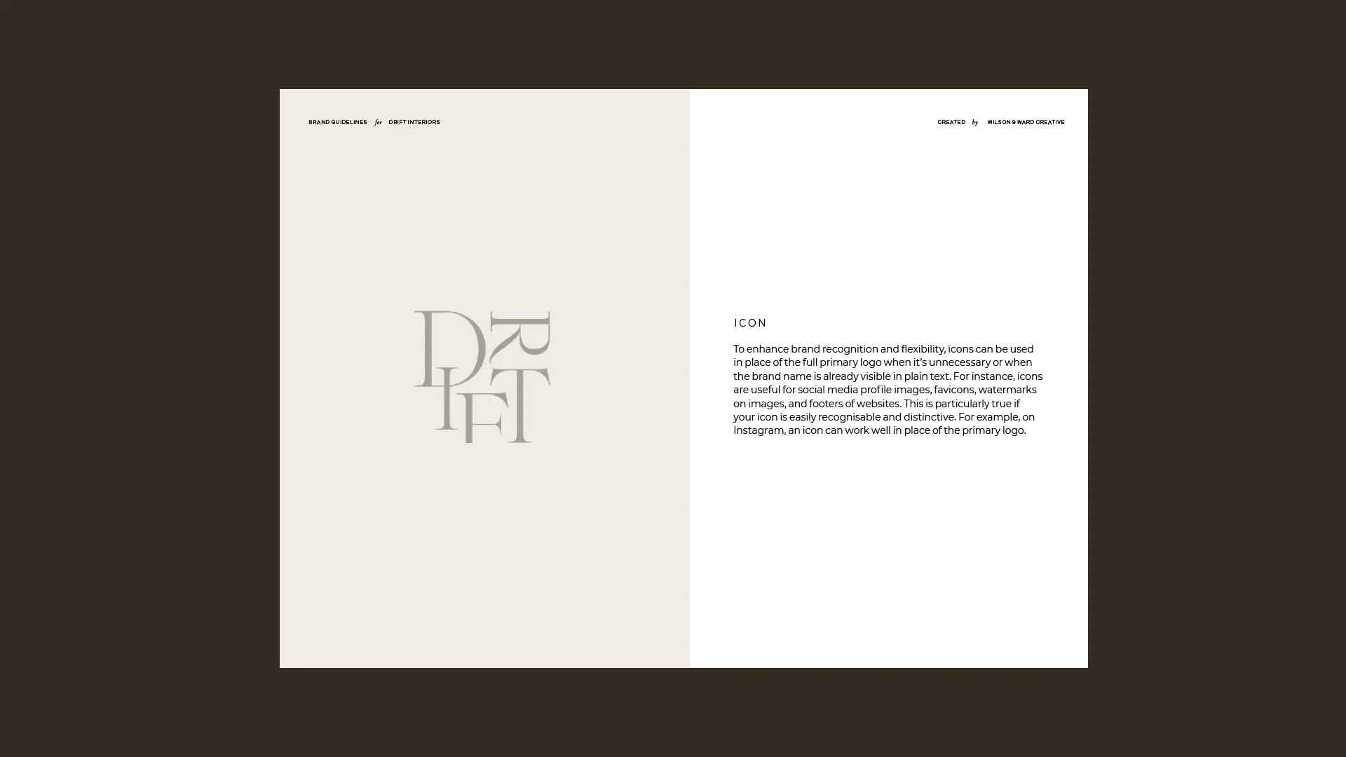
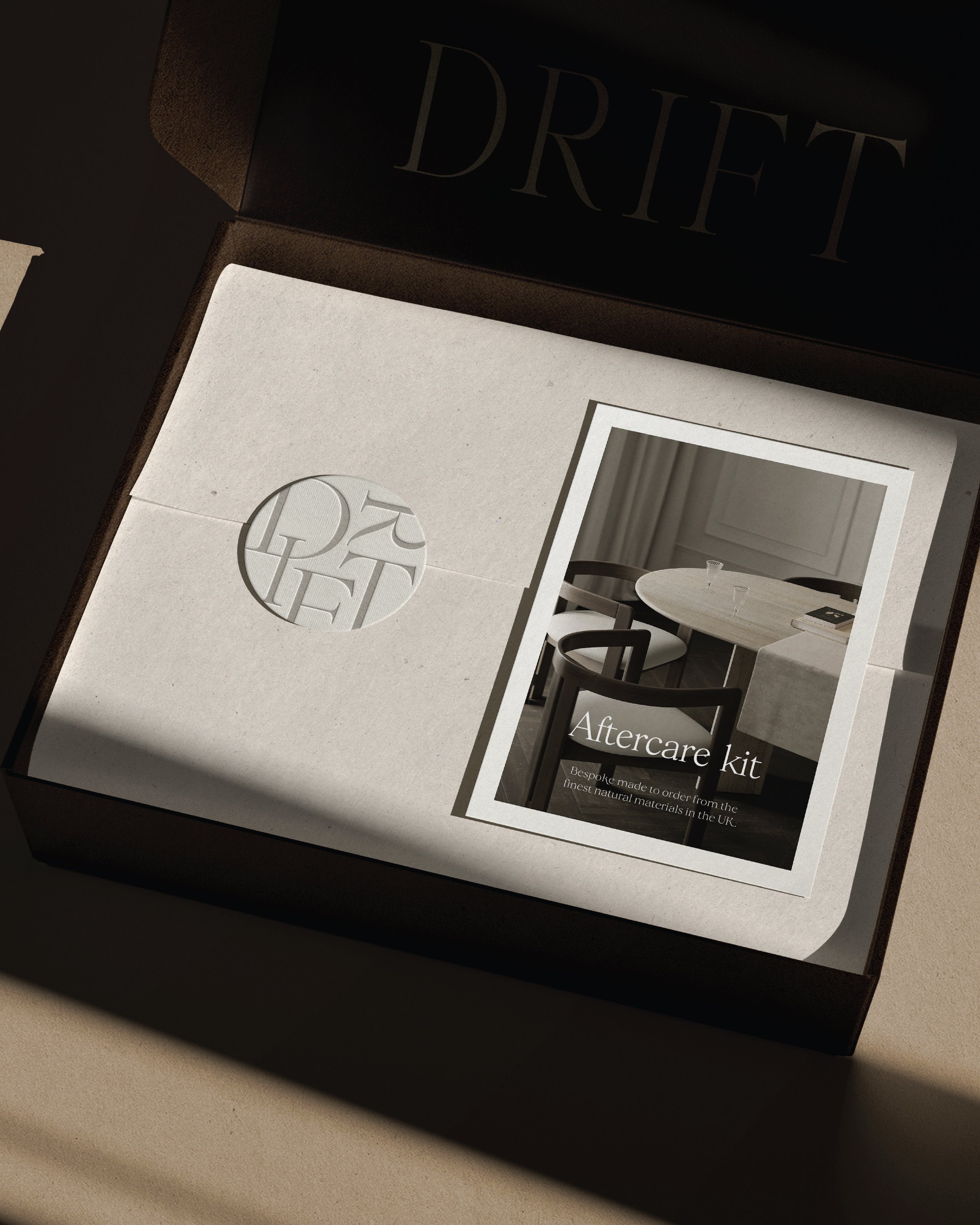
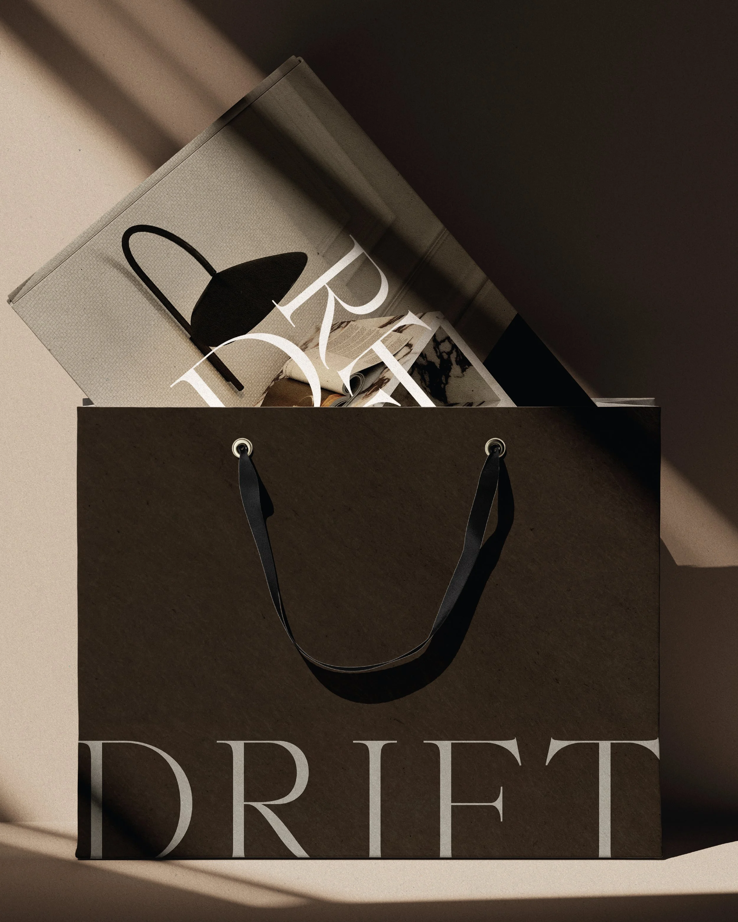
A new primary logo and icon designed to feel distinctive and ownable
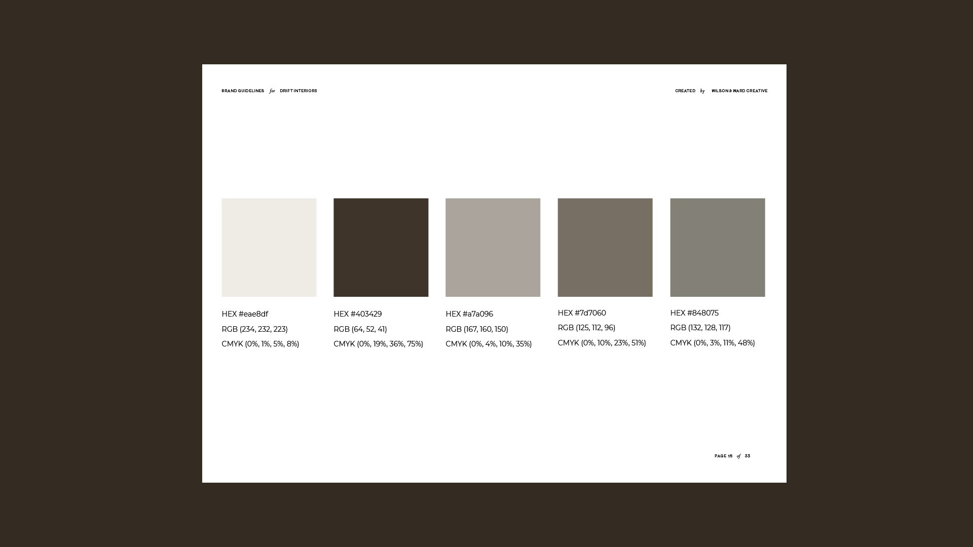
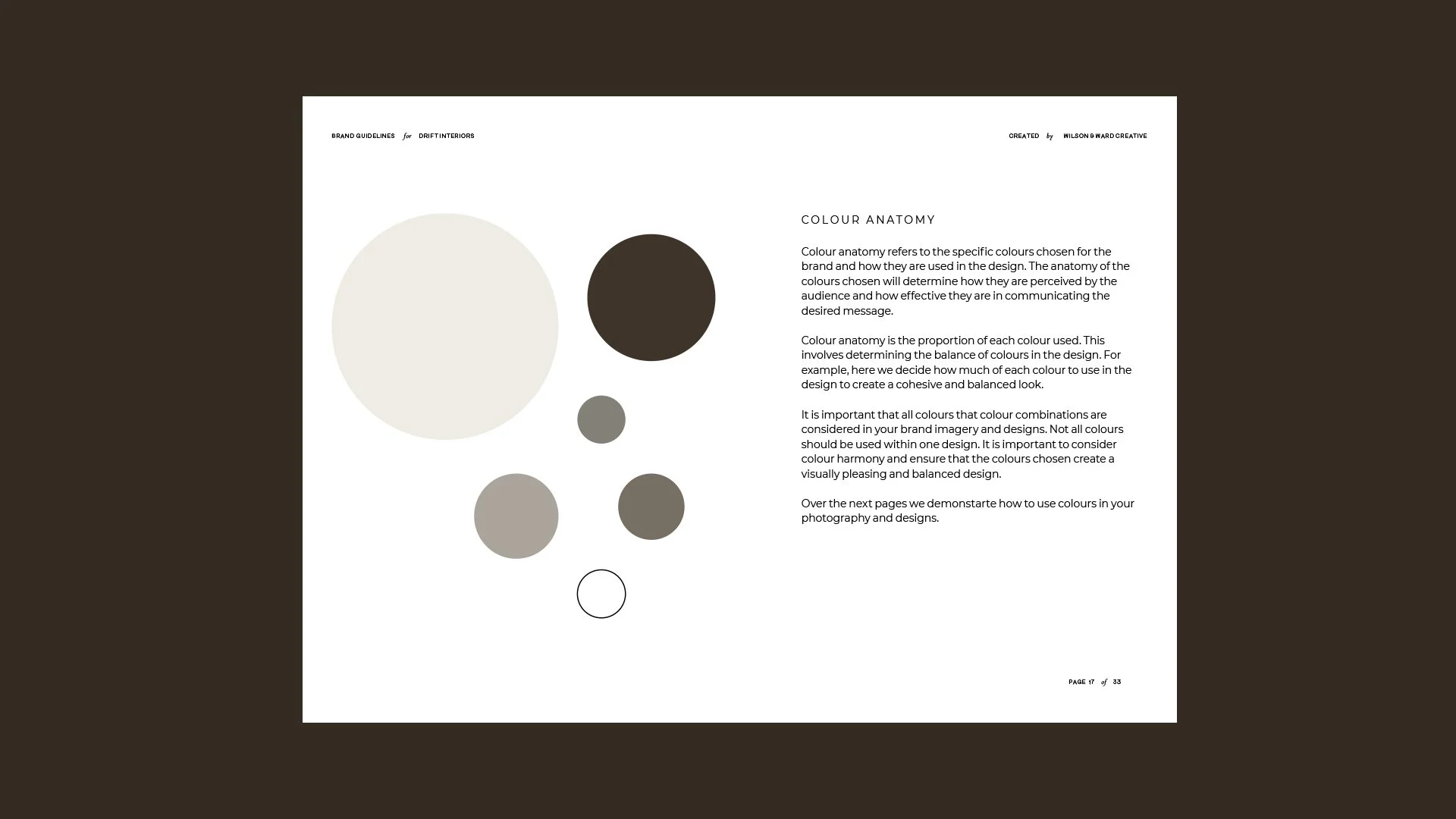
A refined colour palette with depth and warmth
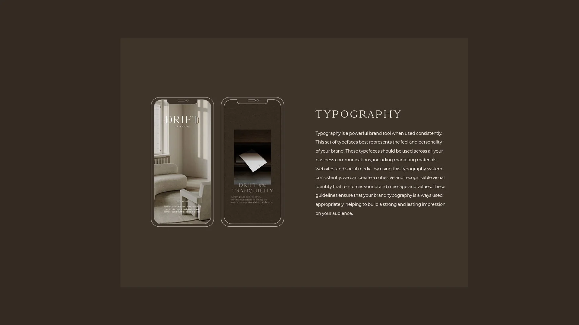
A considered typography system that added character and confidence
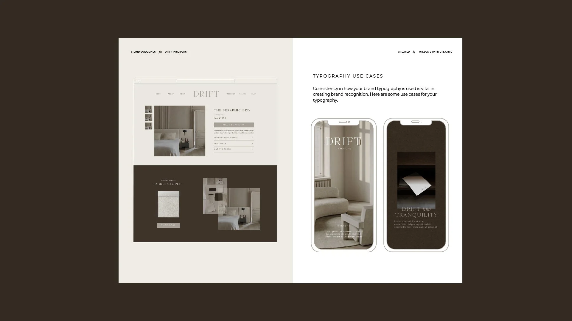
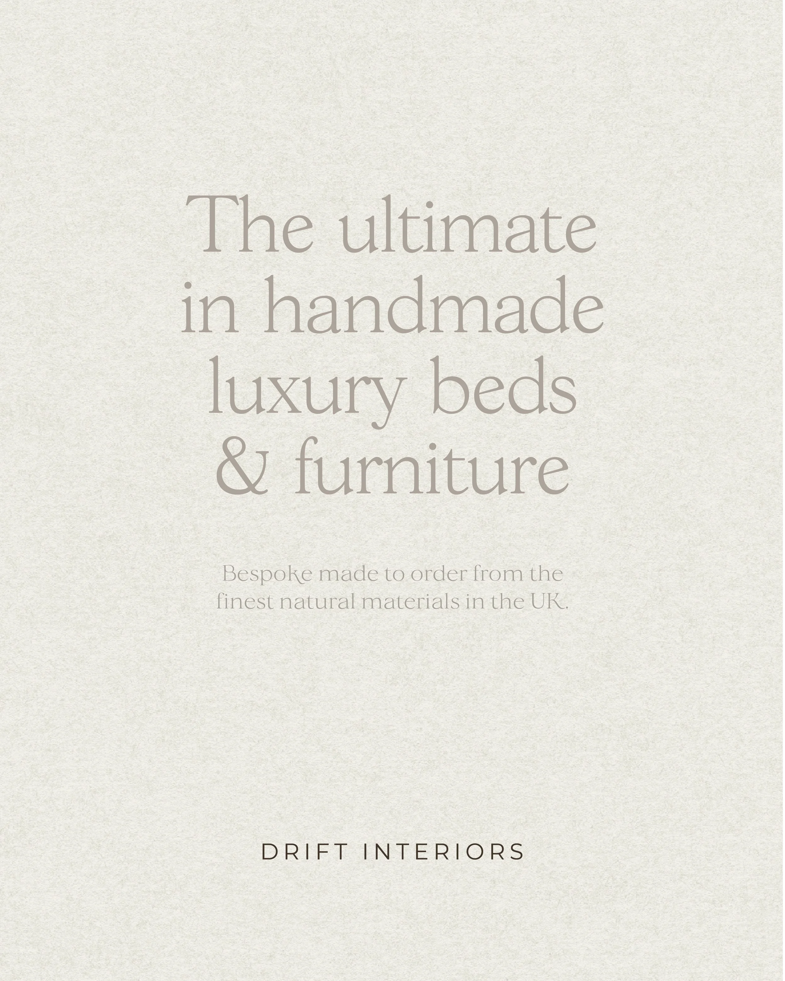
A memorable Shopify website with depth and personality, designed to support growth, not just look good
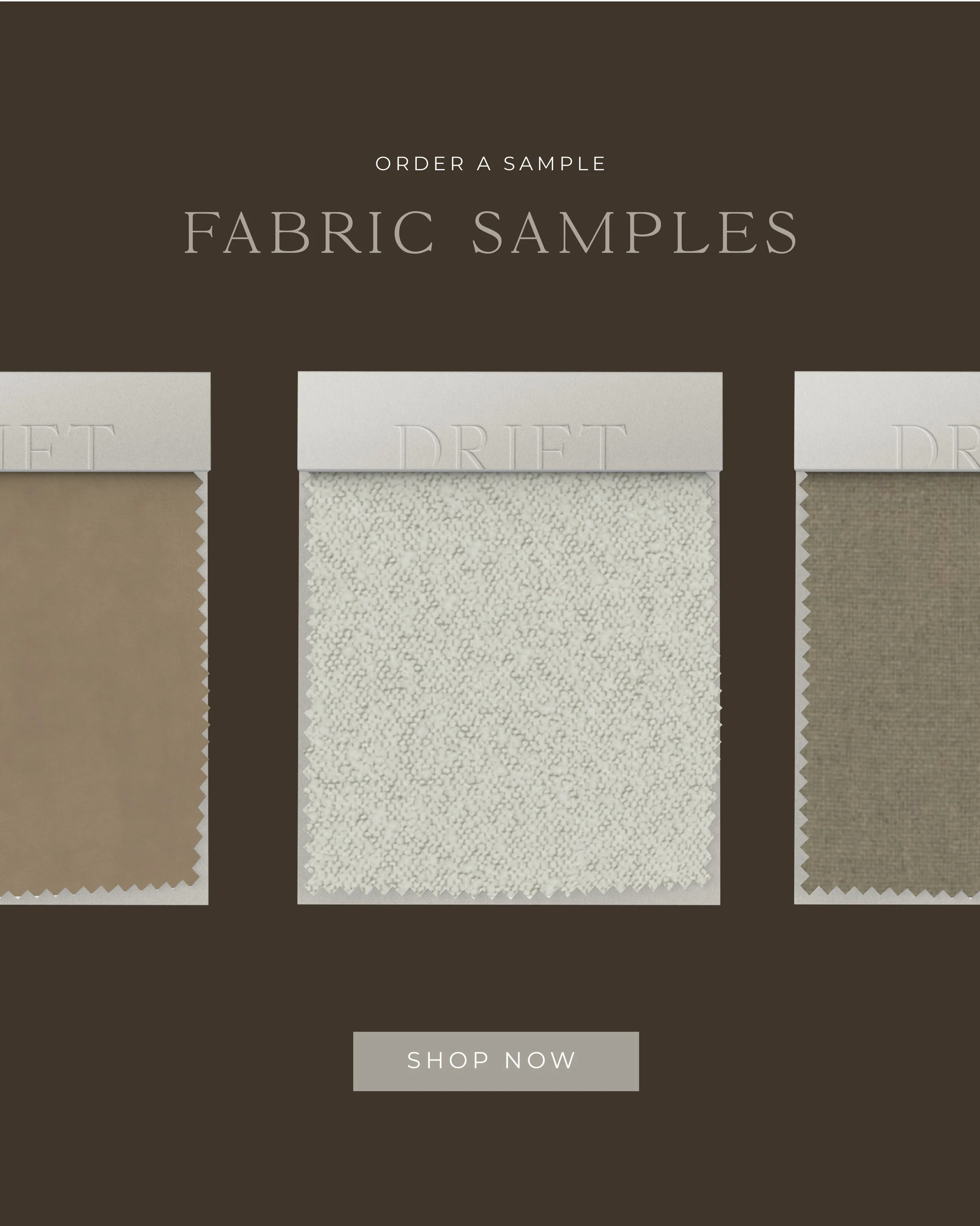
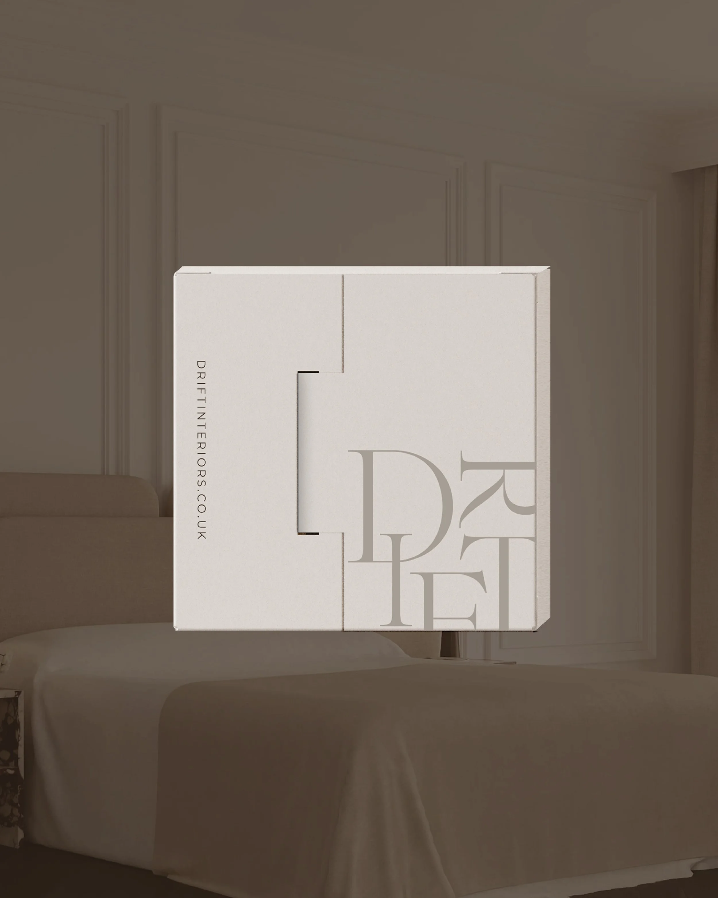
Packaging and supporting brand elements that carried the identity through every touchpoint
A brand experience
The result was a brand that finally matched the quality of the product. One that felt intentional, elevated, and memorable.
Why this matters
When people ask us to “just design a website”, what they’re often really asking for is for their brand to look more premium or more established. A website can support that, but it can’t create it on its own. Without first building the foundations of your brand, you won’t see a true transformation.
Websites don’t build brands. Brands give websites meaning.
Drift’s transformation is a clear example of what happens when you invest in the foundations first. The after isn’t just more visually striking, it’s more strategic. It’s clearer who the brand is for, what it stands for, and why it’s worth choosing.
And that’s what makes it memorable.
This is the first in our Before & After series, where we’ll be sharing honest transformations and the thinking behind them. Not every project starts with a full rebrand, but the most successful ones usually end up there.